

One of the most important aspects of sales management is measuring performance, and using your CRM dashboards is a great way to do this. However, all dashboards are not created equal.
Three of the most common dashboard mistakes are:
- Measuring too many things on one dashboard - Have you seen dashboards that have so many charts you’re not sure what you should focus on? When you continue to add charts on a dashboard (that many times aren’t related) you lose the impact because you can’t focus on the most important KPIs you want to measure.
- Taking a reactive approach vs. a proactive approach - While dashboards do track activity and results, you want to measure that against a goal. Dashboards that just show reports of activities are reports, not actionable snapshots.
- Not using dashboards as the “record of truth” - The best way to drive performance against goals is to make your core dashboards THE place to track performance. Use them in every sales meeting and have them emailed out to the company at least once a week. This not only drives the right behavior, but keeps everyone focused on the KPIs you’ve identified as most important to your business.
What is the purpose of dashboards? They give you the ability to get a snapshot of performance against goals that align back to your sales plan. This helps you quickly determine where you need to focus to ensure that you meet your revenue goals.
I like to separate my dashboards into 4 key dashboards:
- Company Performance
- Team Performance
- Leading Indicator Snapshot
- Wall of Shame
With each of these, you want to determine the time frame you want to track (Daily, Weekly, MTD, QTD, YTD).
Let’s break down each of these dashboards:
1) Company Performance - This is the dashboard that tracks revenue, forecast and pipeline at the company level. I use this dashboard not only with the sales team, but also with the executive team, to track revenue performance vs. goal by team rolled up to top level revenue. Examples of charts you may want to include are.- Revenue vs Goal (MTD, QTD, YTD)- Are you pacing to goal?
- Broken out by team/channel
- Broken out by new vs. expansion
- Rank top 10 AEs and CS ytd in revenue
- Top 10 accounts signed
- Forecast vs. Goal (MTD, QTD, Next Quarter) - Do you have enough in your pipeline to hit your goal?
- Weighed Forecast (you can apply a % to each stage and roll that up to a weighted forecast)
- Broken out by team/channel and by new vs. expansion revenue
- Top 10 forecasted accounts
- New Pipeline vs. Goal (MTD, QTD) - Are you adding enough new pipelines to hit your future goal?
- Pipeline by team / channel
- Pipeline by new vs. expansion revenue
- Churn vs. Goal - Are you tracking to your churn goal? Which accounts are in danger that you could save?
- Churn by team / channel
- 90 Days churn forecast
- “Danger” accounts over a certain size
Here’s an example of one company’s Company Performance Dashboard. They are using “Closing by Channel” as the Forecast.
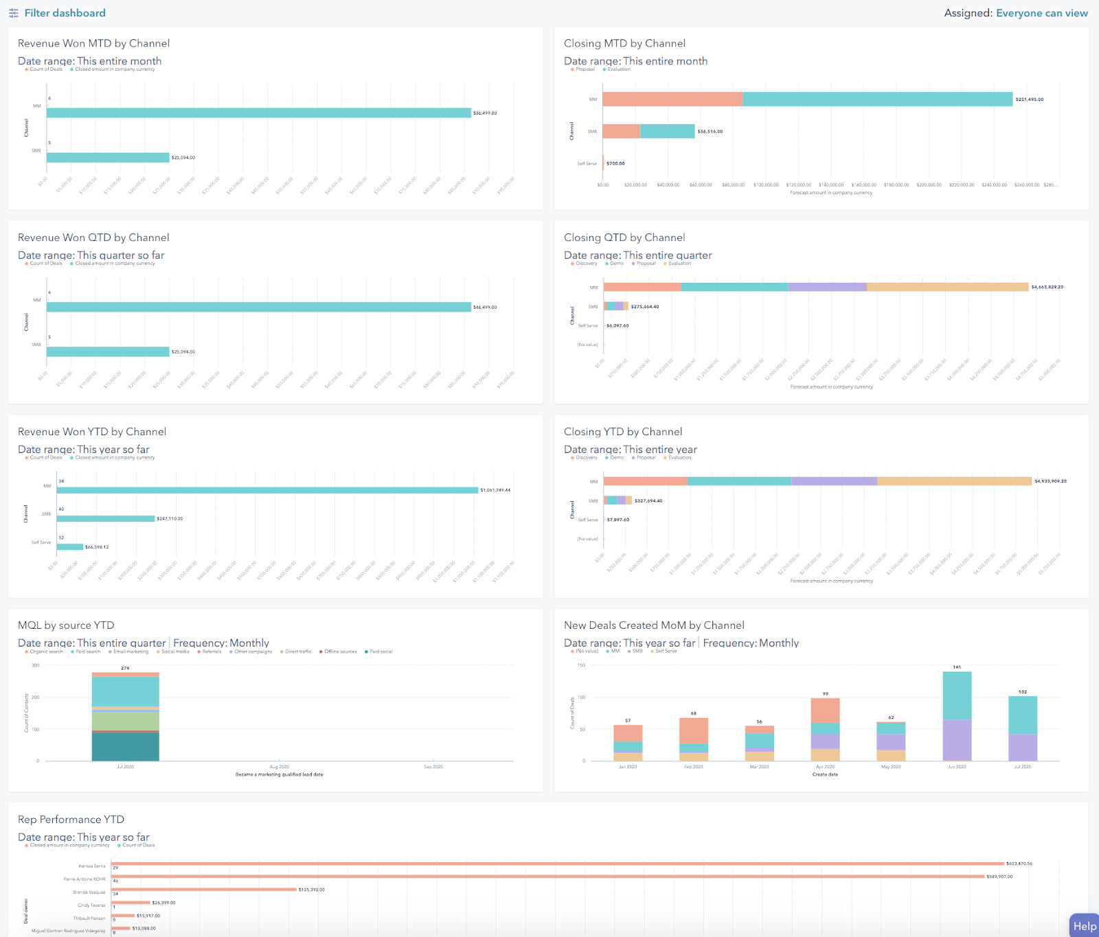
This Dashboard should be emailed to the exec team weekly (or daily depending on your culture) and reviewed in the Exec team weekly meeting.
2) Team Performance - This is the dashboard you will use to track each team’s KPIs on performance and activity. I am a big fan of ranking team members or using colors to quickly identify all team members that have hit the KPI goal, and I typically focus this dashboard on daily, weekly and monthly views to zero in on the activities that matter to drive pipeline forward (although this will vary depending on the length of your sales cycle). Examples of charts for this dashboard include:
- Revenue to Goal (Week, month, quarter) - I like to use the gas tank image for this one so the team can easily see where we are vs. goal for the time period.
- Revenue to goal by rep - Ranking of the reps by revenue and highlight in green, yellow and red
- Forecast to goal - MTD, QTD - Do you have enough in your pipeline to hit your goal?
- Weighted forecast by rep
- Pipeline by stage by rep
- New Pipeline vs. Goal - MTD - Are you adding enough in your pipeline to hit future goals?
- New pipeline created (# of opps or $ amount) by rep vs. goal
- Discovery meetings to goal - Are you talking to enough prospects to add new opportunities to your pipeline?
- Discovery meetings scheduled per rep
- Discovery meetings completed per rep (DM attends the meeting)
- Prospects added to outbound - Are you reaching out to enough prospects to convert to discovery meetings?
- # added by week by rep vs. goal
- # added by month by rep vs. goal
- Activity MTD (measured by week) - It’s worth having this as a gut check, but I’m a bigger fan of measuring how many unique prospects they are talking to that will convert to meetings.
- Stacked activity by rep (calls, emails, etc)
Example of a Team Dashboard
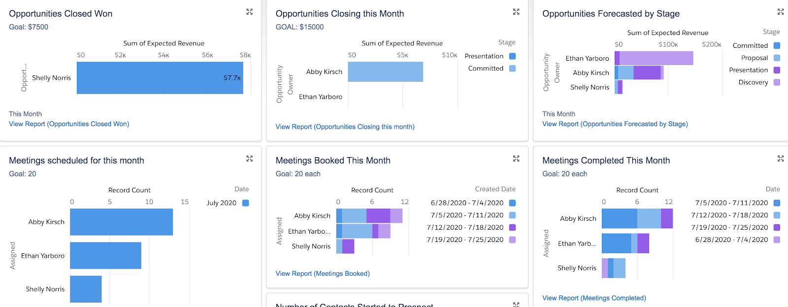
This dashboard should be emailed to the team daily and reviewed every week in the sales meeting and 1:1.
3) Leading Indicator Dashboard - The LI dashboard ties back to your leading indicators of performance and sales model inputs over time to help you determine where you have opportunity to improve.
What leading indicators should you track? The software industry currently rallies around three unit economic goals.
- LTV/CAC > 3
- Payback period < 12 months
- Magic Number > 1.0
These metrics provide a scientific, data-driven definition of go-to-market fit. However, unit economics are lagging indicators. It may take a year or more to assemble enough historical data to accurately calculate our company’s unit economics. Therefore, we need to understand the leading indicators of unit economics. We need to extract the long term unit economics target into short term go-to-market activity goals.
Below is an example of this approach using the LTV/CAC unit economics metric:
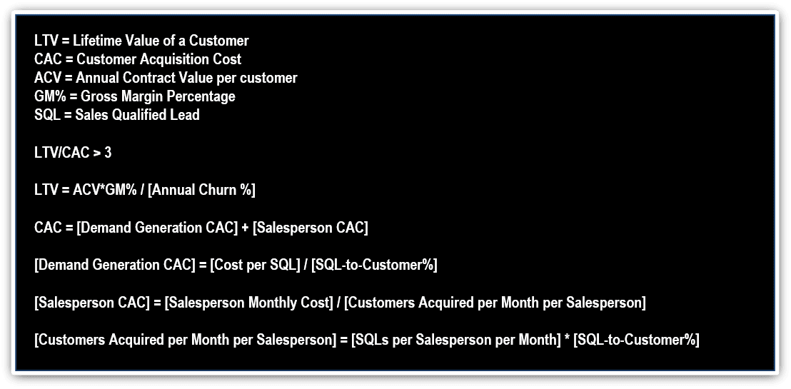
Through fairly simple algebra, we can express the long term goal of:
LTV/CAC > 3
...using near term activities: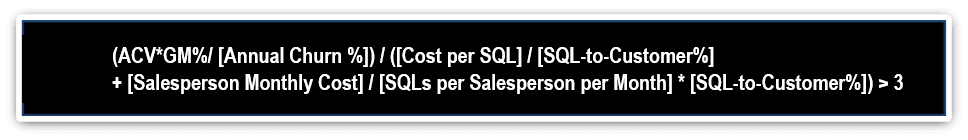
For example, a company may have the following assumptions and results:
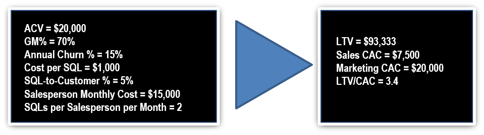
We can now instrument the leading indicators into daily, weekly, or monthly activity charts to evaluate our progress toward go-to-market fit.
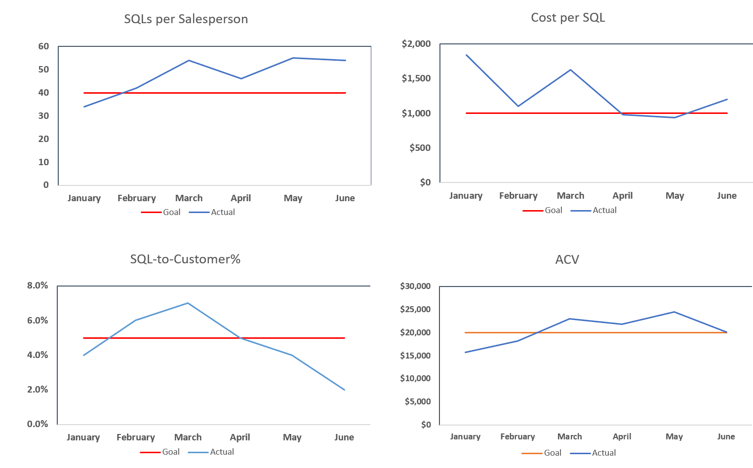
The dashboard above provides monthly, and potentially weekly, updates on how we are tracking against long term unit economics. We are in good shape if the blue line stays above the red line.
Other leading indicators you may want to measure on this dashboard include:
- Average Revenue per rep
- Average # of Deals Closed by rep
- Average # of discovery calls or demos by rep
- Average Deal Size
- Conversion Rates
- Lead to MQL
- MQL to SQL
- SQL to Close
- # of reps meeting quota
- % of deals sold in ICP
This dashboard should be emailed to the exec team weekly and reviewed monthly in the business review.
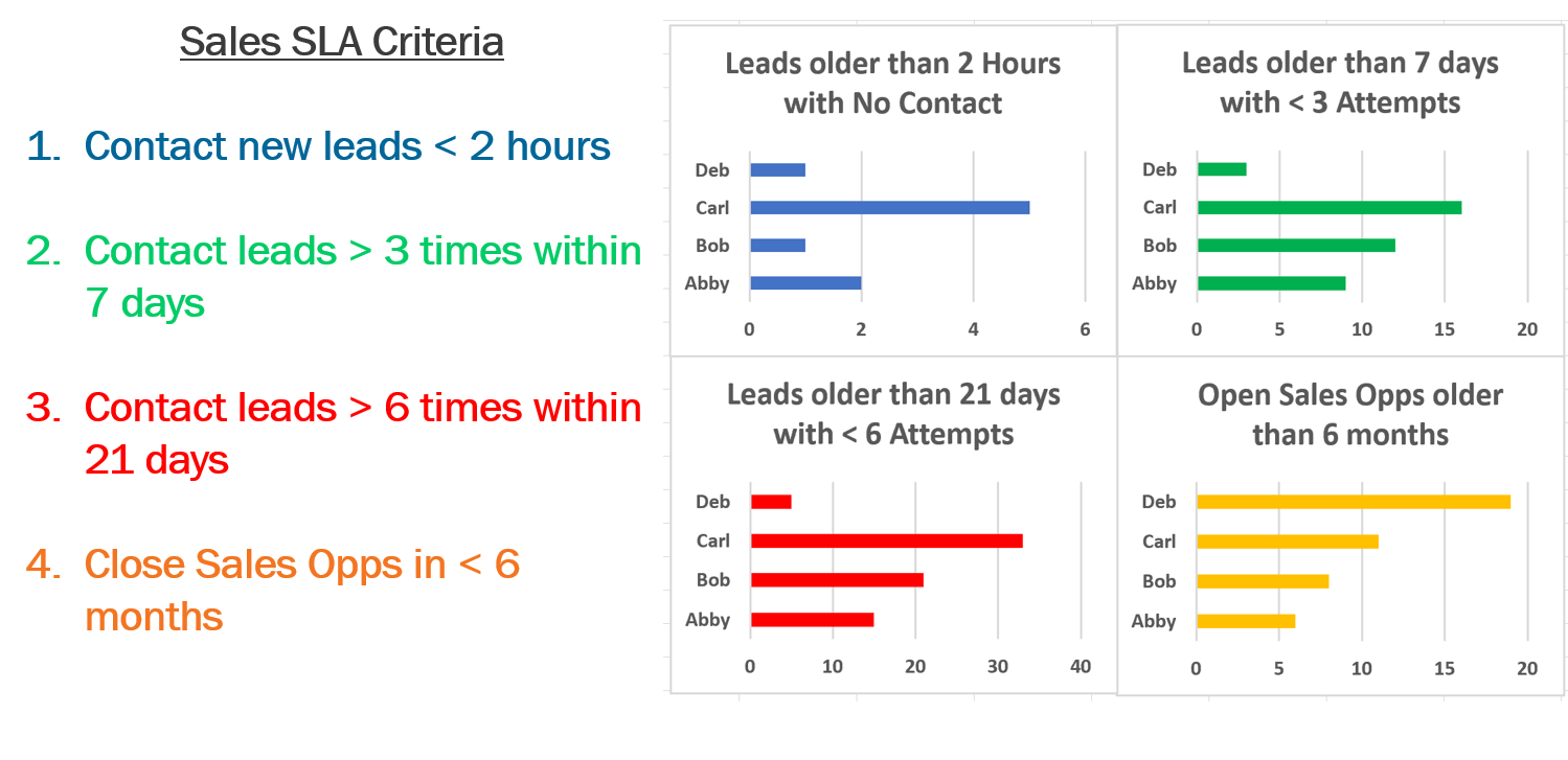
4) Wall of Shame - Also known as the “Needs Attention” Dashboard, this is where you can park exception reports and/or things your reps need to clean up in your CRM. Your rep’s goal is to NOT appear on this dashboard to make sure that they keep their house in order.Examples of charts on this dashboard include:
- Overdue Opportunities - Opportunities still open past the close date
- Overdue activities - Any key activities that are past a due date or accounts that have not had enough outreach attempts
- Opportunities open for longer than X days
- Opportunities or Key Accounts with no activity in the last 30 days
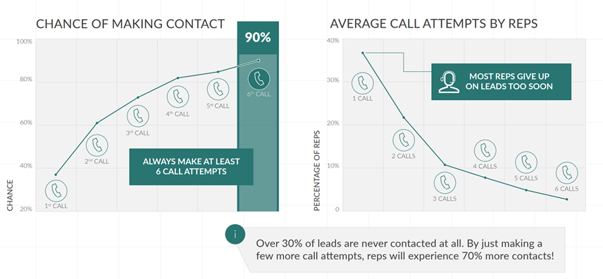
One prospecting mistake teams make is not being persistent enough. The study below from InsideSales.com shows that making only one attempt against a buyer yields a first meeting 40% of the time. Making 6+ attempts yields a first meeting 90% of the time. Persistence pays off. However, the study continues and shows most sellers only make one or two attempts. Simply devising a 6+ attempt prospecting sequence can double the number of first meetings.
This dashboard should be emailed to the sales team daily and reviewed weekly in the sales team meeting and 1:1s.
By grouping your dashboards and aligning them to your sales goals and plan, it will be easier for you to manage your team’s performance in a data driven and visible way. If you don’t have the data you need to build these charts, then you can reevaluate your process to track these metrics in your CRM. When you make your CRM the record of truth, you will have more accurate and consistent data to make good decisions about your business.
If you have a chart or dashboard that is making an impact in your organization, I’d love to hear about it!